Background
It is well-established that crime depresses house prices — buyers pay a premium to live in safer neighbourhoods. Buying a house is my dream, and for most first-time buyers like me, that decision comes with a tight budget and a lot at stake. Given a tight budget, I want to look out for areas in Yorkshire with both lower crime and relatively lower house prices. In other words, are there hidden pockets where safety and affordability coexist?
I am planning to answer this question using spatial analysis. Crime and house prices do not distribute randomly on a map — they tend to cluster. A neighbourhood with a higher crime rate is likely to have neighbouring areas with higher crime rates too. An affluent area tends to sit next to safer and more affluent neighbourhoods as well. Standard correlation might tell you the direction of the relationship, but it cannot tell you where that relationship holds. I will be using Bivariate Local Moran's I to identify specific clusters and spatial outliers across Yorkshire. Specifically, I am interested in looking at the Low Price – Low Crime cluster: areas that are safer and affordable.
The data
There are two data sets used in this analysis. The first is the 2025 median house price data at MSOA level, sourced from the ONS. Each row represents one MSOA with its corresponding median price paid.
#| label: load-packages
#| message: false
#| warning: false
suppressPackageStartupMessages({
library(tidyverse)
library(spData)
library(sf)
library(readxl)
library(tmap)
library(spdep)
library(patchwork)
library(png)
library(grid)
library(bispdep)
library(biscale)
library(cowplot)
library(ggiraph)
library(DT)
})
The second dataset covers total recorded crime offences over the 12-month period from March 2025 to February 2026. The Value column represents the crime rate per 1,000 population.
Finally, the MSOA boundary shapefile is loaded and filtered to retain only areas within Yorkshire and The Humber.
#| warning: false
medianpricepaidmsoa=  read_excel("../data/medianpricepaidmsoa.xlsx",
                                   sheet = "1a", skip = 2)
colnames(medianpricepaidmsoa) = gsub(" ", "_", colnames(medianpricepaidmsoa))
 hp_data = medianpricepaidmsoa %>%
  select(Local_authority_code, Local_authority_name, MSOA_code, MSOA_name, Year_ending_Sep_2025)


head(hp_data,10)
#| warning: false
Crimedata2526 = read_excel("../data/MSOA_Total crime offences (12 month total)_Mar-2025 to Feb-2026.xlsx",
                           sheet = "Data")

colnames(Crimedata2526) = gsub(" ", "_", colnames(Crimedata2526))

head(Crimedata2526, 10)
#|echo: false
#|message: false
#|warning: false
msoa_map = read_sf("../data/MSOA2021UK/MSOA_2021_EW_BGC_V3.shp")

MSOA_LAD = read_csv("../data/MSOA_(2021)_to_Built-up_Area_to_Local_Authority_District_to_Region_(December_2022)_Lookup_in_England_and_Wales_v2.csv")

MSOA_LAD = MSOA_LAD %>%
  filter(RGN22NM == "Yorkshire and The Humber")


msoa_map = msoa_map %>%
  filter(MSOA21CD %in% MSOA_LAD$MSOA21CD)
Patterns Before the Statistics
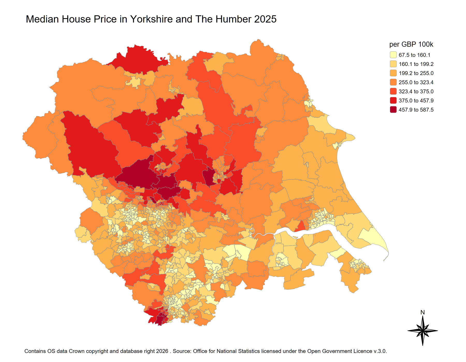
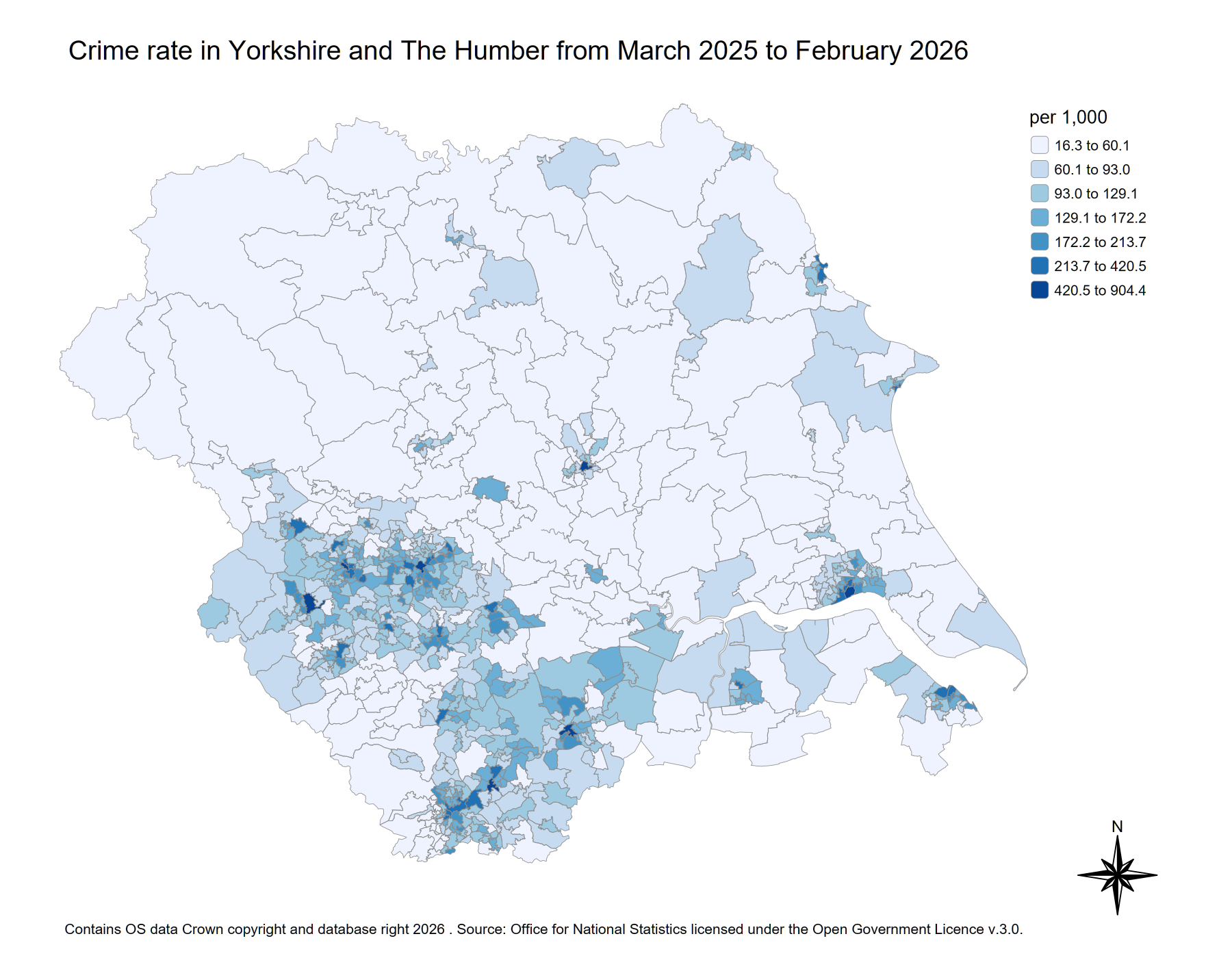
By looking at the distribution of house prices and crime, we can tell they are not spread evenly.What stands out most is the contrast between the two colour scales. The darkest reds — the most expensive MSOAs — rarely overlap with the darkest blues. Conversely, lighter house prices tend to coincide with deeper crime concentrations. This visual opposition is a signal of a negative spatial relationship between the two variables. However, maps alone cannot confirm whether these patterns are statistically meaningful. That us what the Bivariate Local Moran's I will do in next section.
#|echo: false
#|message: false
#|warning: false


joined_df = msoa_map %>%
  left_join(hp_data, by = c("MSOA21CD" = "MSOA_code")) %>%
  mutate(
    Year_ending_Sep_2025 = Year_ending_Sep_2025/1000) %>%
  left_join(Crimedata2526, by = c("MSOA21CD" = "Area_Code")) %>%
  rename(Houseprice_2025 = Year_ending_Sep_2025,
         crime_rate = Value )


hp_map = tm_shape(joined_df) +
  tm_polygons(
    fill = "Houseprice_2025",
    fill.scale = tm_scale_intervals(
      breaks = quantile(
        joined_df$Houseprice_2025,
        probs = c(0, 0.25, 0.5, 0.75, 0.9, 0.95, 0.99, 1),
        na.rm = TRUE
      ),
      values = "YlOrRd"
    ),
    col = "grey55",
    col_alpha = 0.9,
    lwd = 0.5,
    fill.legend = tm_legend("per £100k", group_id = "top",frame = FALSE)
  )+
  tm_layout(
    frame = FALSE,
    legend.position = c("right", "top"),
    legend.frame = FALSE,
    inner.margins = c(0.1, 0.00, 0.03, 0.15)
  ) +
  tm_title("Median House Price in Yorkshire and The Humber 2025")+
  tm_compass(
    type = "8star",
    size = 4,
    position = c("RIGHT", "bottom"),
    color.light = "white"
  )+
  tm_credits(
    paste("Contains OS data \u00A9 Crown copyright and database right",
          # Get current year
          format(Sys.Date(), "%Y"),
          ". Source:\nOffice for National Statistics licensed under the Open Government Licence v.3.0."
    ),
    size = 0.7,
    position = c("LEFT", "BOTTOM")
  )


crime_map = tm_shape(joined_df) +
  tm_polygons(
    fill = "crime_rate",
    fill.scale = tm_scale_intervals(
      breaks = quantile(
        joined_df$crime_rate,
        probs = c(0, 0.25, 0.5, 0.75, 0.9, 0.95, 0.99, 1),
        na.rm = TRUE
      ),
      values = "Blues"
    ),
    col = "grey55",
    col_alpha = 0.9,        # fully transparent border colour
    lwd = 0.5,
    fill.legend = tm_legend("per 1,000", group_id = "top",frame = FALSE)
  )+
  tm_layout(
    frame = FALSE,
    legend.position = c("right", "top"),
    legend.frame = FALSE,
    inner.margins = c(0.1, 0.00, 0.03, 0.15)
  ) +
  tm_title("Crime rate in Yorkshire and The Humber from March 2025 to February 2026")+
  tm_compass(
    type = "8star",
    size = 4,
    position = c("RIGHT", "bottom"),
    color.light = "white"
  )+
  tm_credits(
    paste("Contains OS data \u00A9 Crown copyright and database right",
          # Get current year
          format(Sys.Date(), "%Y"),
          ". Source:\nOffice for National Statistics licensed under the Open Government Licence v.3.0."
    ),
    size = 0.7,
    position = c("LEFT", "BOTTOM")
  )


hp_map
crime_map
The Bivariate Global Moran's I
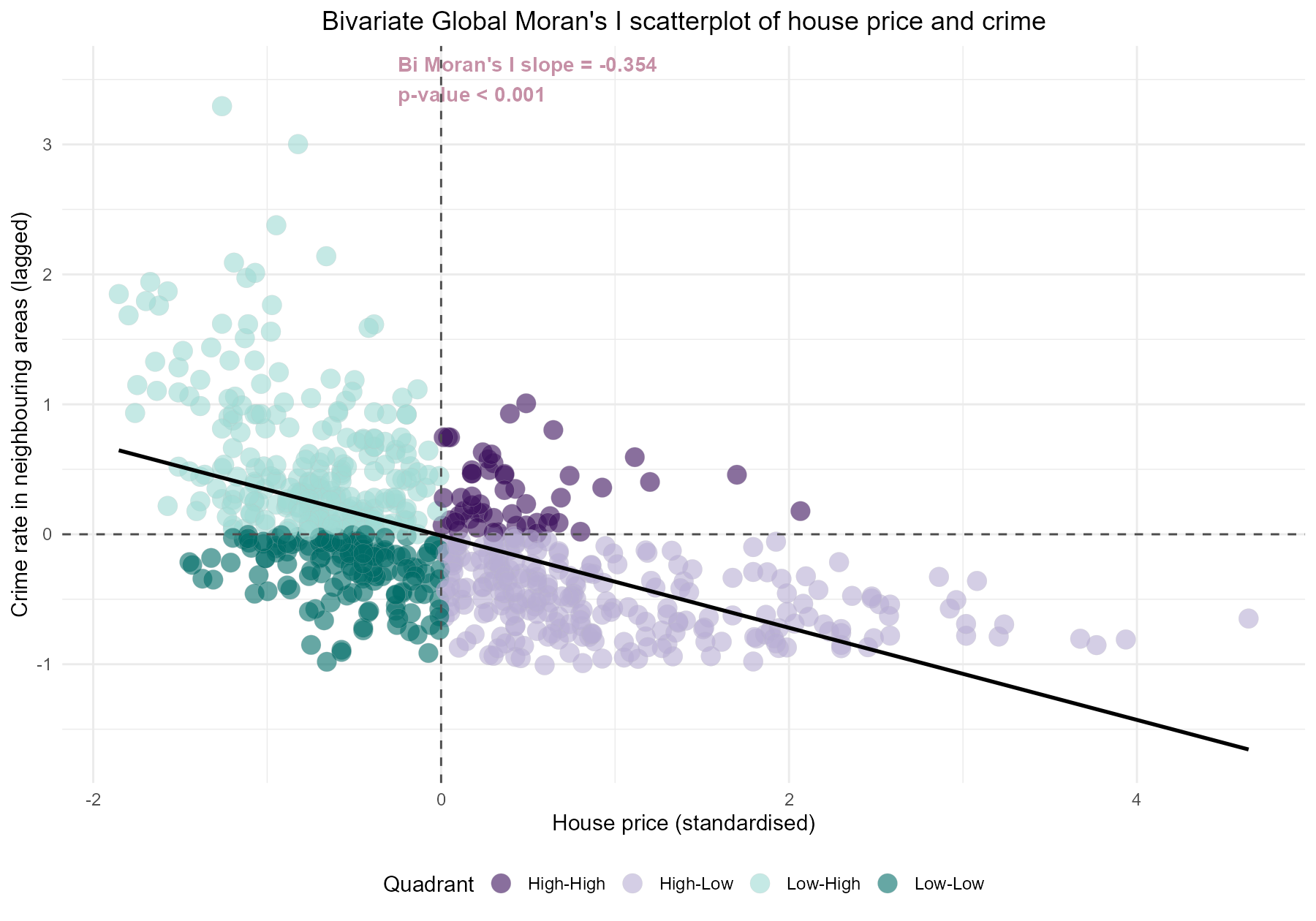
The scatterplot confirms what the maps suggested — there is a statistically significant negative spatial relationship between house prices and crime across Yorkshire and The Humber. The Bivariate Global Moran's I of -0.354 (p < 0.001) which is also the slope of the scatter plot below.
The four quadrants each describe a different type of neighbourhood:
-
Low-High — low house price areas surrounded by high-crime neighbours. These are the most concentrated cluster in the plot, suggesting that affordability in Yorkshire often comes with a less desirable neighbourhood context.
-
Low-Low — low house price areas surrounded by low-crime neighbours. This is the quadrant I am most interested in — affordable areas that are not dragged down by surrounding crime.
-
High-Low — high house price areas surrounded by low-crime neighbours. The expected pattern: affluent, safe, and expensive.
-
High-High — high house price areas surrounded by high-crime neighbours. Relatively rare, but these likely reflect dense urban centres where price and crime coexist for example, city centre apartments.
#|echo: false
#|message: false
#|warning: false
##########################################################
### Create spatial neighbours and weights ----

nb = poly2nb(joined_df, queen = TRUE)


nbw = nb2listw(nb, style = "W", zero.policy = TRUE)

########################################################
#bi-variate g moran
bi_gmoran = moran.bi(joined_df$Houseprice_2025, joined_df$crime_rate, nbw)

bv = moran_bv(joined_df$Houseprice_2025, joined_df$crime_rate, nbw, nsim=9999)

p_value_two_sided = (sum(abs(bv$t) >= abs(bv$t0)) + 1) / (length(bv$t) + 1)


#create standardised claim
joined_df$Houseprice_2025_std = as.numeric(scale(joined_df$Houseprice_2025))

#create spatial lag of standardised claim
joined_df$lagged_Houseprice_2025 = lag.listw(nbw, joined_df$Houseprice_2025)

#create standardised IMD
joined_df$crime_rate_std = as.numeric(scale(joined_df$crime_rate))

#create spatial lag of standardised claim
joined_df$lagged_crime_rate= lag.listw(nbw, joined_df$crime_rate_std)


joined_df = joined_df %>%
  mutate(
    bi_moran_quadrant_nop = case_when(
      Houseprice_2025_std >= 0 & lagged_crime_rate >= 0 ~ "High-High",
      Houseprice_2025_std <  0 & lagged_crime_rate <  0 ~ "Low-Low",
      Houseprice_2025_std >= 0 & lagged_crime_rate <  0 ~ "High-Low",
      Houseprice_2025_std <  0 & lagged_crime_rate >= 0 ~ "Low-High",
      TRUE ~ NA_character_
    )
  )


bimoran_slope = bi_gmoran$I


### ggplot Moran scatterplot ----
plot_scatter_bi =ggplot(joined_df, aes(x = Houseprice_2025_std , y=lagged_crime_rate))+
  geom_point(aes(fill = bi_moran_quadrant_nop), size = 7, alpha = 0.6, shape=21, stroke=0.1, color = "grey")+
  annotate(
    "text",
    x = -0.25,
    y = 3.5,
    hjust=0,
    label = paste0("Bi Moran's I slope = ", round(bimoran_slope, 3),"\n",
                   "p-value < 0.001 "),
    fontface = "bold",
    size = 4,
    color = "#c690a6") +
  annotate(
    "text",
    x = 3,
    y = 3,
    hjust = 0,
    label = paste0("High house price area near \nhigh total crime neighours"),
    fontface = "bold",
    size = 3) +
  annotate(
    "text",
    x = -1.75,
    y = 3,
    hjust = 0,
    label = paste0("Low House price near \nhigh total crime neighours"),
    fontface = "bold",
    size = 3) +
  annotate(
    "text",
    x = -1.75,
    y = -1.4,
    hjust = 0,
    label = paste0("Low House price area near \ntotal crime neighours"),
    fontface = "bold",
    size = 3) +
  annotate(
    "text",
    x = 3,
    y = -1.4,
    hjust = 0,
    label = paste0("High House price near \nlow total crime neighours"),
    fontface = "bold",
    size = 3) +

  geom_hline(yintercept = 0, linetype = "dashed", color = "grey30")+
  geom_vline(xintercept = 0, linetype = "dashed", color = "grey30")+
  geom_smooth(method = "lm", se=FALSE, colour = "black", size = 1)+
  scale_y_continuous()+
  scale_fill_manual(values = c(        "High-High" = "#3B0F5C",
                                       "Low-Low"   = "#006D67",
                                       "High-Low"  = "#B7AED4",
                                       "Low-High"  = "#9EDAD3"
  ))+
  labs(fill = "Quadrant",
       x = "House price (source)",
       y = "Total crime in neighbouring areas (lagged)")+
  ggtitle("Bivariate Global Moran's I scatterplot of House price and Total crime \nacross Yorkshire and The Humber")+
  theme_minimal(base_size = 10)+
  theme(legend.position = "bottom",
        plot.title = element_text(hjust=0.5))

plot_scatter_bi
The Bivariate Local Moran's I
The Global Bivariate Moran's I gives a single summary statistic for the whole of Yorkshire and The Humber. It is useful for confirming whether a spatial relationship exists, but it cannot tell us where that relationship holds. This is why Local Bivariate Moran's I is used next. Rather than asking whether there is an overall relationship, it asks where specific combinations of house price and neighbouring crime are clustered and if they are statistically significant.
The Low-Low cluster is the most interesting category for this analysis because it points to areas with relatively low house prices surrounded by low-crime neighbours. In theory, these are the “affordable but still relatively safe” areas. Unfortunately, there are not that many of them. Where they do appear, they are mainly located around parts of North Yorkshire, East Riding of Yorkshire and North Lincolnshire.
Now, it is worth asking — why are these areas cheap if they are safe? Safety alone does not push prices up. A lot of these Low-Low areas are likely quieter, more rural or suburban pockets that simply are not an attractive area. They may lack good transport links, be far from major employment centres, or just not have the kind of amenities that drive prices up.
The large grey area across West and South Yorkshire — the urban core — is mostly non-significant, meaning that the local relationship between house prices and crime there is too mixed or inconsistent to form a clear cluster.
#|echo: false
#|message: false
#|warning: false

bilmoran =localmoran_bv(joined_df$Houseprice_2025, joined_df$crime_rate, nbw, nsim = 9999, alternative = "two.sided")


joined_df$bilmoranI = bilmoran[, "Ibvi"]
joined_df$bilZscore = bilmoran[, "Z.Ibvi"]
joined_df$bilPvalues = bilmoran[, "Pr(z != E(Ibvi)) Sim"]


joined_df = joined_df %>%
  mutate(
    bi_moran_quadrant = case_when(
      Houseprice_2025_std >= 0 & lagged_crime_rate >= 0 & bilPvalues < 0.05~ "High-High",
      Houseprice_2025_std <  0 & lagged_crime_rate <  0 & bilPvalues < 0.05~ "Low-Low",
      Houseprice_2025_std >= 0 & lagged_crime_rate <  0 & bilPvalues < 0.05~ "High-Low",
      Houseprice_2025_std <  0 & lagged_crime_rate >= 0 & bilPvalues < 0.05~ "Low-High",
      bilPvalues >= 0.05 ~ "Non-significant"
    )
  )


######################################################################################
joined_df$tooltip = paste0("LA: ", joined_df$Local_authority_name, "\n",
                           "MSOA21NM: ", joined_df$MSOA21NM, "\n",
                           "MSOA21CD: ", joined_df$MSOA21CD, "\n",
                           "House price: £", round(joined_df$Houseprice_2025), "K", "\n",
                           "Crime rate: ", round(joined_df$crime_rate), " per 1000", "\n",
                           "Group : ", joined_df$bi_moran_quadrant)


interactive_biplot = ggplot(joined_df)+
  geom_sf_interactive(mapping = aes(fill =bi_moran_quadrant,tooltip = tooltip), color = "white")+
  labs(
    title = "House price and total crime per 1000 in 2025 in \nYorkshire and The Humber",
    caption = paste("Contains OS data \u00A9 Crown copyright and database right",
                    # Get current year
                    format(Sys.Date(), "%Y"),
                    ". Source:\nOffice for National Statistics licensed under the Open Government Licence v.3.0.")
  ) +
  theme_void(base_size = 10) +
  scale_fill_manual(values = c(  "High-High" = "#3B0F5C",
                                 "Low-Low"   = "#006D67",
                                 "High-Low"  = "#B7AED4",
                                 "Low-High"  = "#9EDAD3",
                                 "Non-significant" = "gray"))+
  theme( plot.caption.position = "plot",
         plot.caption = element_text(hjust = 0, size = 8),
         plot.margin = margin(t = 20, r = 20, b =20, l = 20),
         axis.title.x = element_blank(),
         axis.title.y = element_blank(),
         axis.text.x  = element_blank(),
         axis.text.y  = element_blank(),
         axis.ticks   = element_blank(),
         legend.position = "bottom",
         legend.text = element_text(size=8),
         plot.title = element_text(size=12))+
  labs(fill = "")+
  ggspatial::annotation_north_arrow(
    location = "br",
    which_north = "true",
    height = grid::unit(1, "cm"),
    width  = grid::unit(1, "cm"),
    pad_x = unit(0.35, "in"),
    pad_y = unit(0.05, "in"),
    style = ggspatial::north_arrow_nautical(
      fill = c("black", "white"),
      line_col = "grey20",
      text_family = "ArcherPro Book"
    )
  )


interactive_biplot = girafe(interactive_biplot)

tooltip_css="
  background: rgba(255, 255, 255, 0.97);
  color: #1f2937;
  padding: 10px 12px;
  border-radius: 12px;
  border: 1px solid rgba(17, 24, 39, 0.12);
  box-shadow: 0 10px 24px rgba(0, 0, 0, 0.18);
  font-size: 16px;
  line-height: 1.35;
  font-family: -apple-system, BlinkMacSystemFont, Segoe UI, Roboto, Arial, sans-serif;
"

hover_css = "
  cursor: pointer;
  stroke: #111827 ;    /* darker border */
  stroke-width: 1.5px ;  /* thicker border */
  opacity: 1 ;         /* keep fill the same */
  transition: all 0.15s ease-out;
"


interactive_biplot = girafe_options(
  interactive_biplot,
  width_svg = 9,
  height_svg = 7,
  opts_hover(css = hover_css),
  opts_tooltip(css = tooltip_css),
  opts_hover_inv(css = "")
)

interactive_biplot
Conclusion
We have investigated the relationship between house prices and crime and the results confirm an overall negative spatial autocorrelation in the Yorkshire and The Humber. We further looked into areas where we are most interested in aka the "Low house price and low crime" cluster. However, there are very limited Low-low clusters that are statistically significant and these clusters are mainly areas that might be far away from city centres, lacking in good transport links and amenities.
So the honest answer to my original question is: yes, those hidden pockets exist — but they come with trade-offs. Whether those trade-offs are worth it really depends on lifestyle and priorities.
Either way, this was a fun way to use what i have learnt for a very personal decision. It also taught me that finding a first home is not just about scrolling through Rightmove — it is also a spatial statistics problem. In my case, it might just be time to save more and accept that, unlike a Tesco meal deal, safety, convenience and affordability rarely come neatly bundled together.